In my February post about the Internet Infrastructure Map, I ended with “See You Next Year.” I usually only touch the map once a year when I pull new data and write up an annual update. This year I kept tinkering with it anyway, and enough has changed that it didn’t feel right waiting until next February. You can check out the current version at map.kmcd.dev.
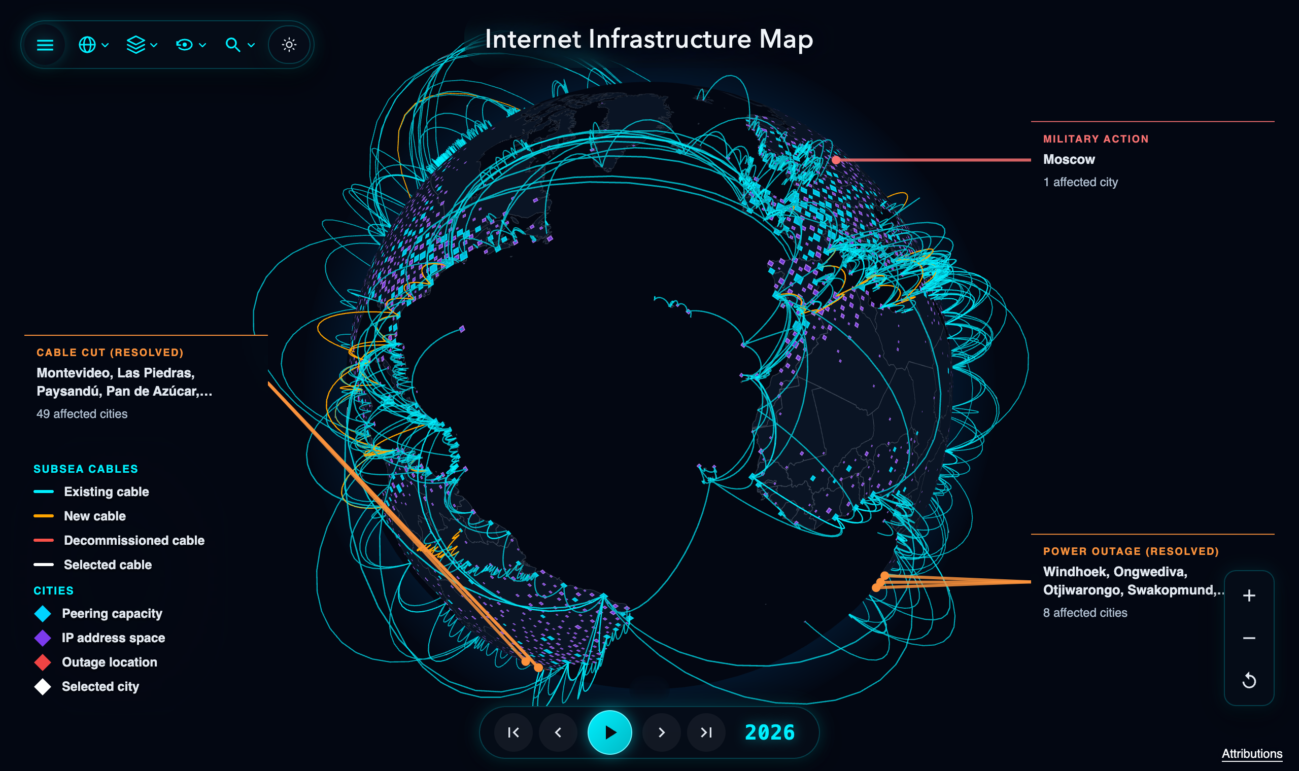
The 3D globe view @ map.kmcd.dev
3D Globe
Up until now, the map used Leaflet. The tileset I was using with Leaflet dropped its free tier and started requiring a paid API key. I found an alternative for a while, but I didn’t like how things felt. This update is the end result of that saga: I replaced Leaflet with Three.js and ditched standard map tiles altogether. Instead, I use an SVG for the country lines and rasterize it (with a cache) to an offscreen <canvas> texture for the visible viewport whenever zoom settles, so borders stay sharp at any zoom level. The 3D Globe is now the default, though you can still switch back to the 2D view (which swaps to an orthographic Web Mercator Three.js scene while keeping your camera position synced).
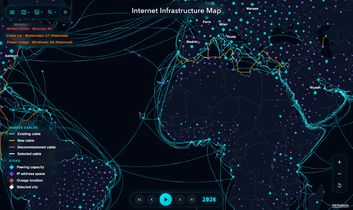
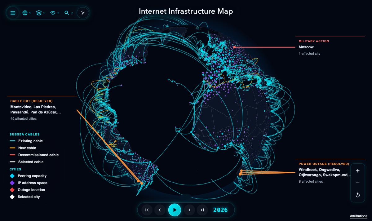
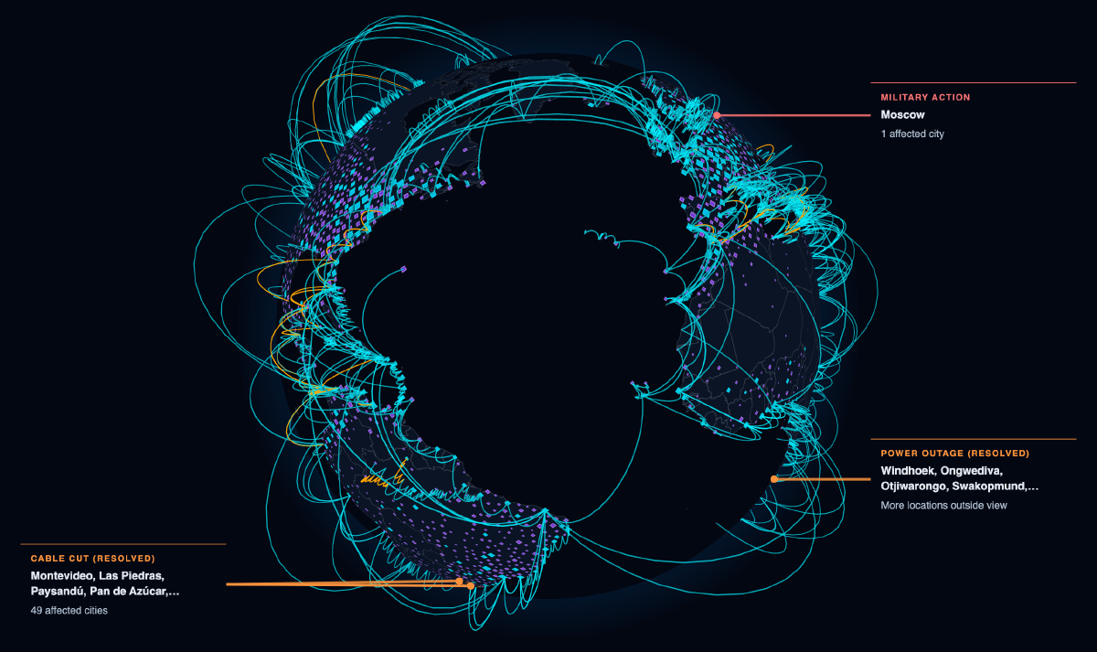
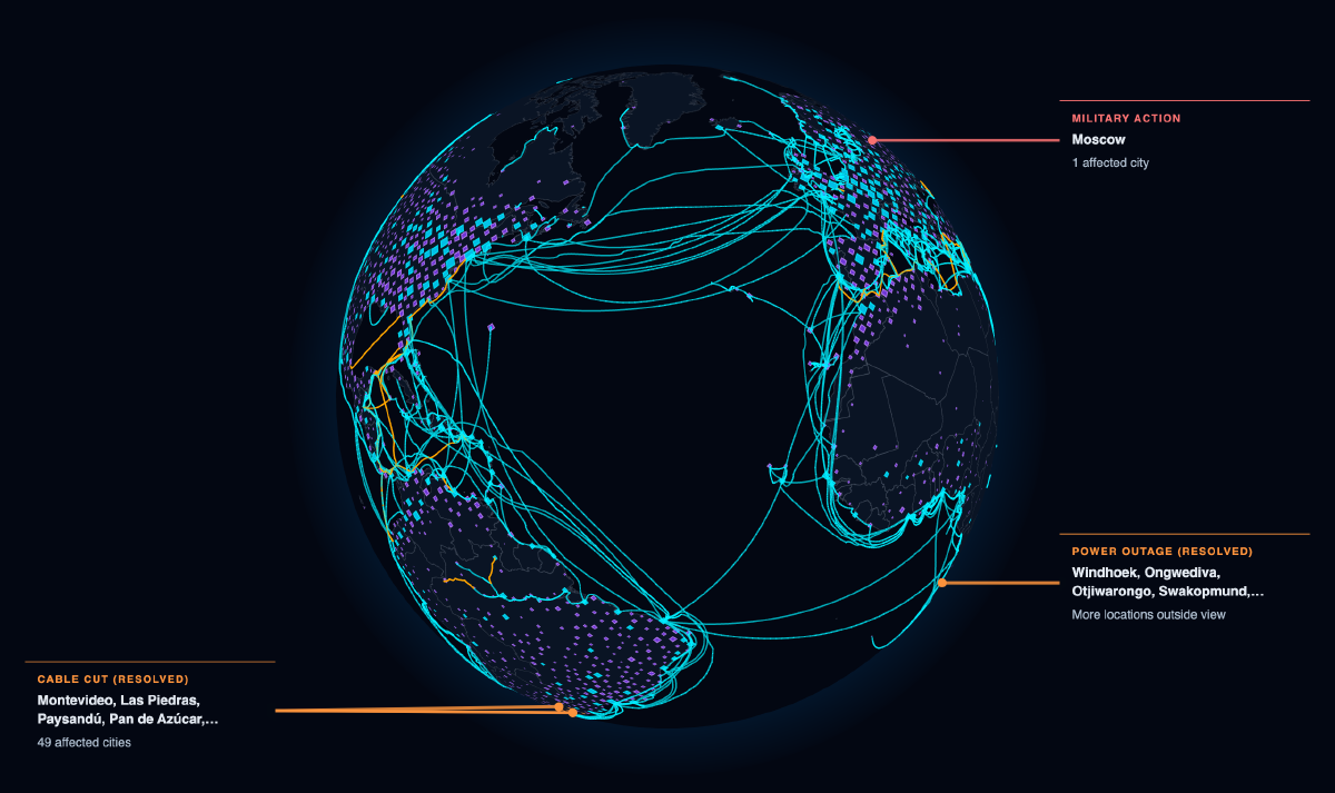
For the cables on the 3D globe, I added two ways to view them. In Arches mode, cables arc above the globe between landing stations with animated pulses. In Surface mode, the cables stay flat along their estimated undersea routes.
More BGP Data
In Part 1, I only mapped IPv4 BGP routes and filtered out smaller cities to keep the map from bogging down. This time I added IPv6 routes (measured by announced subnet count rather than raw address count so a single /64 doesn’t dwarf the entire IPv4 internet), kept all of the smaller cities on the map, and pulled historical GeoIP snapshots for each year back to 2010 instead of relying on a single modern database. Zooming in also adds text labels for the largest cities in view.
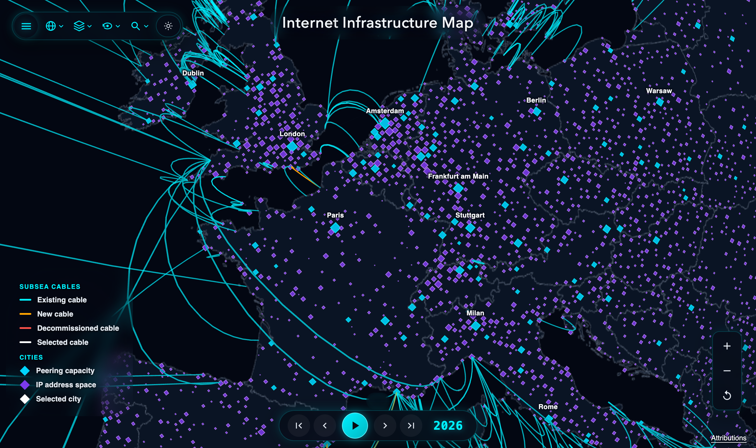
Western Europe with individual BGP cities and city labels.
On the map, blue dots are cities with public IXP peering and purple dots are cities that only announce BGP IP space. Once I put all of the smaller cities on the globe, I kept noticing big purple dots sitting right on top of major fiber lines with millions of IPs and no local IXP at all. I’m working on a follow-up post about why that happens and what it does to your traffic if you live in one of those cities.
Rather than manually running the data scripts once a year, the map data now updates automatically on the first of every month from the latest BGP routing tables and PeeringDB snapshots.
Layers and Filtering
You can toggle individual layers (text labels, outage alerts, cable display mode, peering capacity, IPv4 addresses, and IPv6 subnets) from the layers menu in the top toolbar:

The layers menu for toggling text, outage alerts, cable display mode, peering, IPv4 space, and IPv6 subnets.
The search bar in the toolbar also filters both the 3D globe and 2D map across cables, cities, and countries at once. For example, filtering for France isolates every submarine cable landing in France alongside its peering and BGP cities:
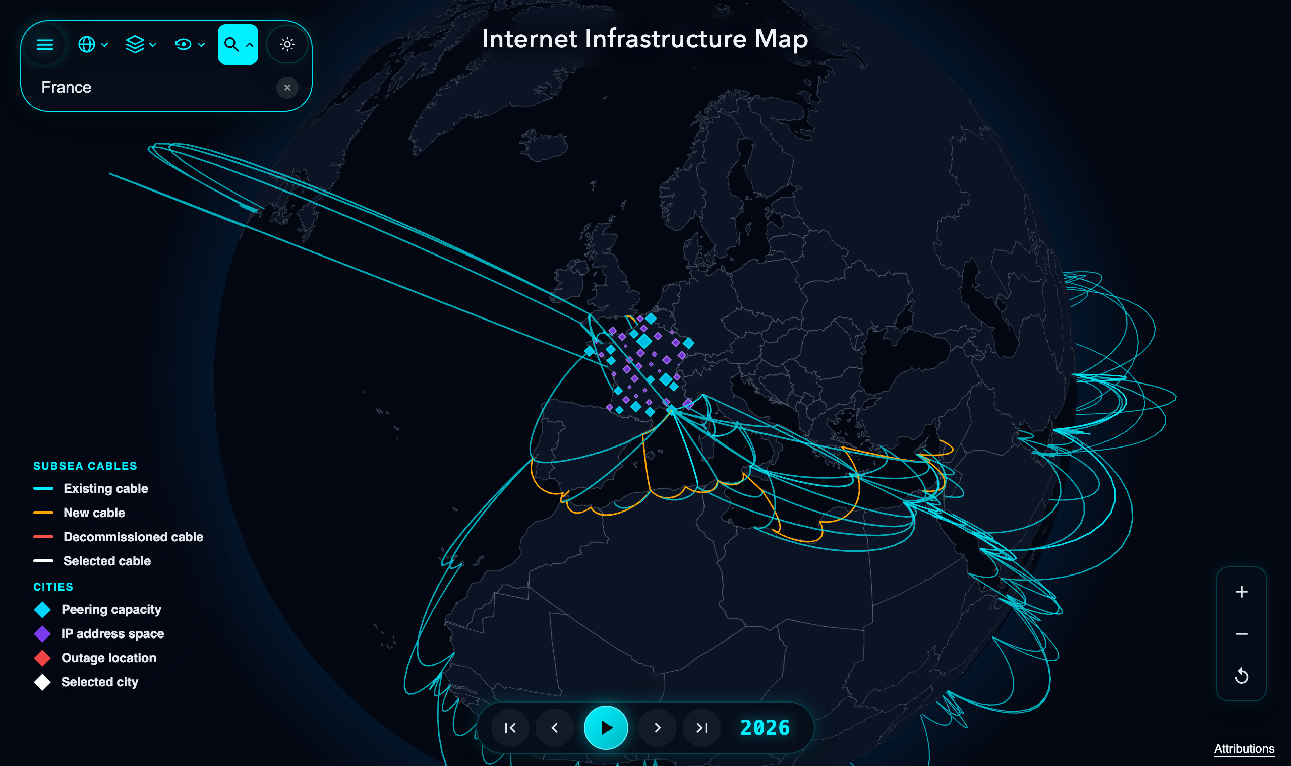
Searching for ‘France’ isolates French cities and every submarine cable landing in the country.
Performance
Putting all of those cities and cables onto a 3D globe at once initially made the page very slow, both on initial load and when zooming in and out.
To keep initial page loads fast and the map running at 60 FPS, the initial view loads a pre-clustered global overview while a Web Worker streams in regional city tiles on demand as you zoom in and handles the clustering off the main thread. I also shrank the initial download by delta-encoding the country boundary GeoJSON and trimming coordinate precision on the cable routes. Hovering over a cable used to rebuild its Three.js geometry on every mouse move. Now all cables are merged into a single mesh where a texture update highlights the selected route, and raycasting is disabled on the background country polygons.
Historical Data
If you dragged the timeline slider back to the 1990s or early 2000s on the old map, a lot of old cables were either missing or had the wrong activation and retirement years. I went through historical cable records to add the missing systems and fix retirement dates. You can also download the full list of cables (from 1858 to 2026) as a CSV at cables.csv. If you notice any errors in the data, please reach out.
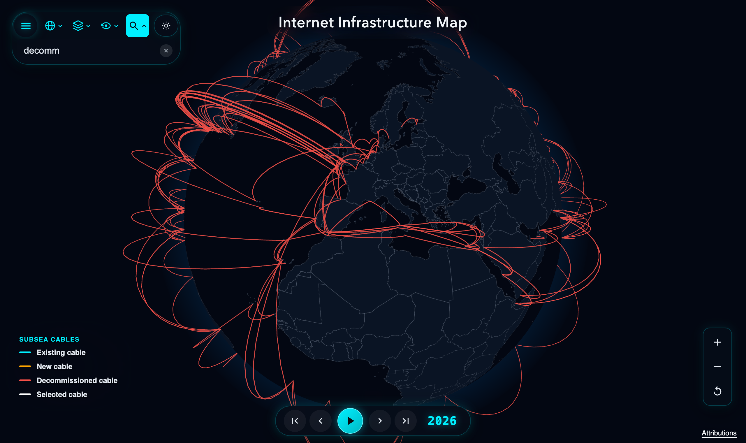
Filtering for decommissioned cables (q=decomm) across the historical dataset.
There is also a new Statistics panel that updates as you move the timeline slider or type in a search filter, showing how many cables are active and how much bandwidth each region has in that year:
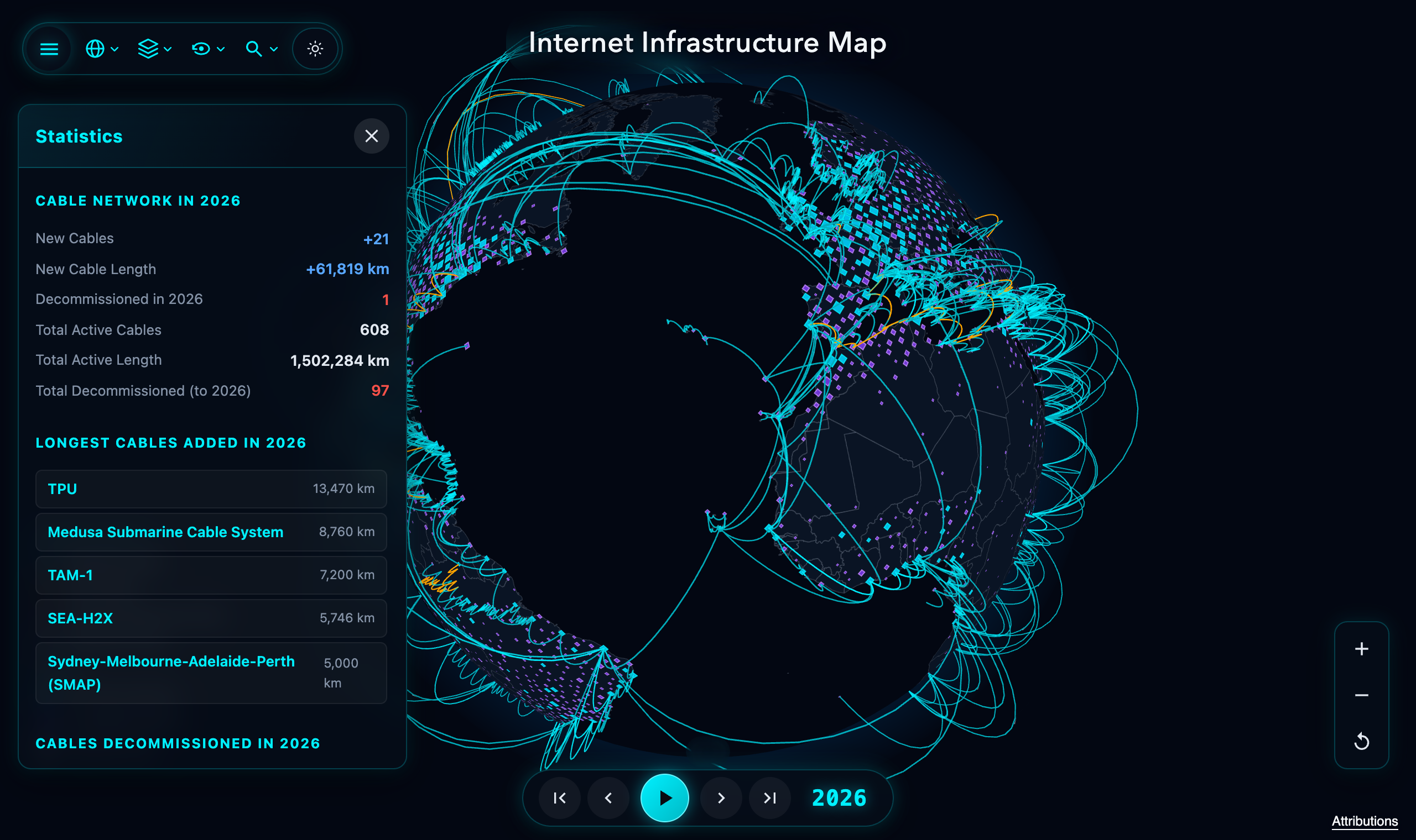
The Statistics panel for the selected year.
Outage Alerts
I also wanted map.kmcd.dev to show active internet disruptions alongside the physical and routing layers. The map now pulls outage and anomaly alerts from Cloudflare Radar and IODA (Internet Outage Detection and Analysis) every 15 minutes and overlays them directly onto the globe.
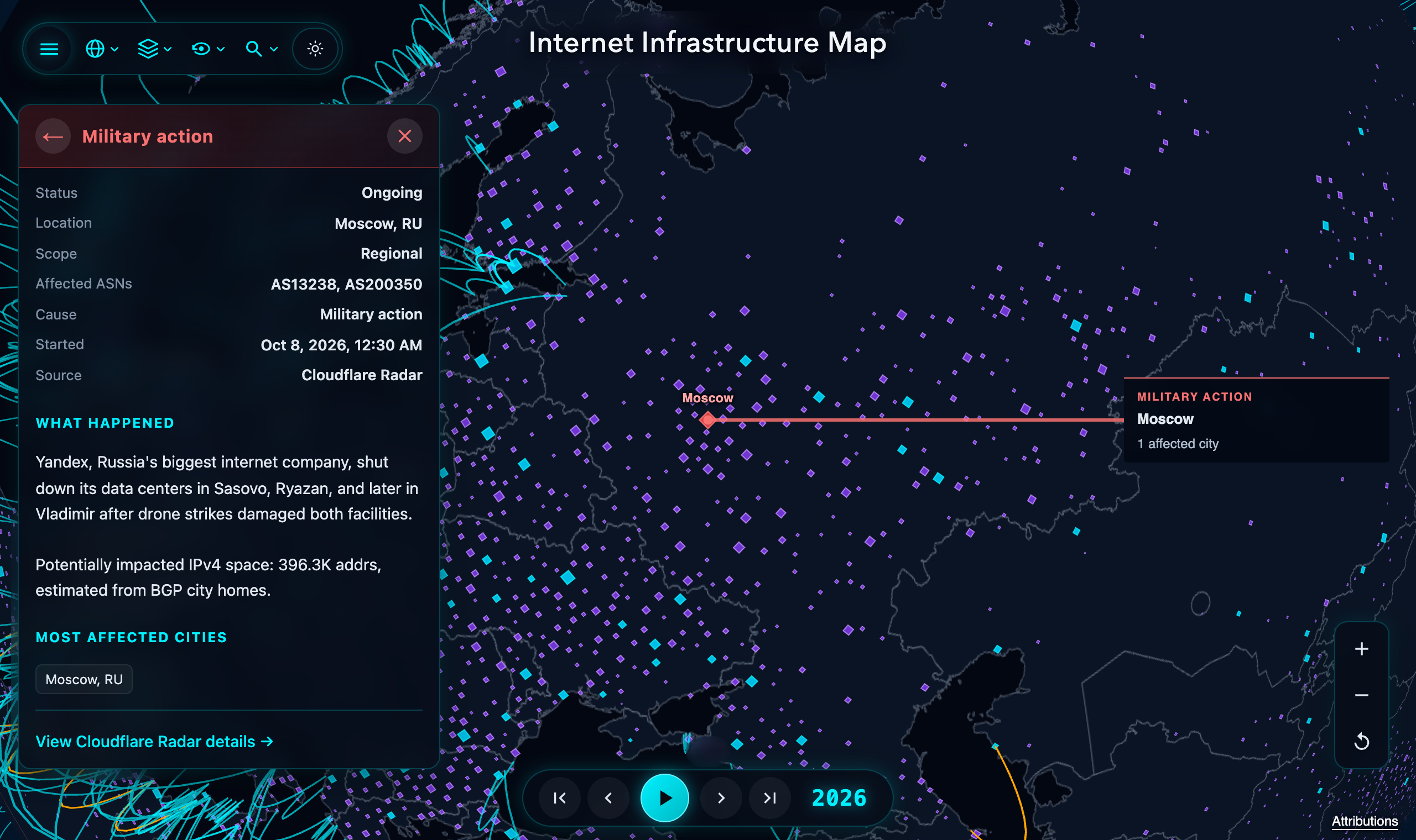
Active outage alerts on the map, with links to Cloudflare Radar.
Countries with an active outage highlight in red on the globe, and clicking the alert badge opens the incident details with a link out to the upstream outage report. When I first added this, I forgot to hide the alerts when scrubbing the timeline slider, so for a day or two it looked like Cloudflare was reporting live outages in 1995.
End
We’ll have to see what direction this takes next year. I’m really happy with how the project has evolved, starting as a simple rendering of submarine cables and growing into a map that glues together routing tables, peering databases, historical archives, and live outage feeds into a single view.
You can explore the updated map here: map.kmcd.dev