Building a Live BGP Map
Right now, thousands of routers are arguing about how to reach each other. That’s expected. It’s how the Internet works. This website wouldn’t load without it. BGP (Border Gateway Protocol) continuously announces and withdraws prefixes, adjusting how traffic moves globally. Most people see URLs and apps; routers see prefixes and AS paths.
I made a map that lets us listen in on this conversation, but in a relaxing, aesthetically pleasing way.
In my last post, I mentioned a websocket-based streaming API from RIPE. At the time, I set it aside. Soon, it became my obsession and the live view was born. While this visualization occasionally stumbles into being practically useful for spotting global outages, my primary requirement was simply to build a really cool looking map.
You can check out the source code for this project on GitHub or watch the map in action on my YouTube channel or here:
What are we looking at?
This map is a live visualization of the Border Gateway Protocol (BGP). This is the “language” routers use to talk to each other and decide the best path for your data to travel across the globe.
Imagine a router trying to find the best way to send traffic to Google. It receives multiple path advertisements from its neighbors, and it has to pick the most efficient route:

Every pulse on the map represents a real routing update. Sometimes it’s routine churn. Sometimes it’s maintenance, an outage, or a path change somewhere along the way.
The Global Game of Telephone
To understand why the map pulses, you have to look at how routers talk. BGP is a path-vector protocol, which is effectively a global game of telephone. When a network (an Autonomous System, or AS) wants to be found, it tells its immediate neighbors, who tell their neighbors, and so on.
- The Announcement: When a router in Tokyo says, “I have a path to
8.8.8.0/24,” it sends an Update to its peers. Every peer that hears this stamps the message with its own ID before passing it along. This list of stamps is called the AS Path. - The Selection: Routers generally prefer the shortest path. If an observer in New York hears the same news from London (2 hops) and Sydney (5 hops), it will automatically choose the shorter London route. On the live map, you will see this selection light up as a purple pulse.
- The Withdrawal: If a fiber line is cut, for example, the router sends a Withdrawal. This is where the game of telephone gets frantic. Neighbors start checking their old notes: “Wait, I can’t go through London anymore? What about that longer path through Sydney I heard about earlier?”
Here is how that “envelope” looks as it travels from Tokyo to New York. Notice how the path grows longer at every step.

Because routers often wait a few seconds before passing news along (to avoid “vibrating” the whole internet with every tiny hiccup), these updates arrive in waves. On the live map, this looks like a ripple of activity starting at the origin and washing over the globe as the “signatures” accumulate.
Spotting a BGP Flap
If you are watching the map and suddenly see a wave of pulses lighting up all over the world at the exact same time, you might be witnessing a BGP flap.

In networking, flapping happens when a route rapidly appears and disappears. Imagine a misconfigured router or a loose fiber cable. The router yells to the Internet, “I have a path to Google!” only to drop the connection a second later and say, “Never mind, it is gone”. That single localized hiccup doesn’t stay local. It ripples outward as routers everywhere recalculate their paths. To keep the whole system from grinding to a halt, modern routers use Route Flap Damping. This essentially puts the noisy network in a time-out until it proves it can stay stable.
Decoding the Pulses
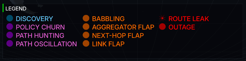
When you see those colored pulses popping off on the map, they represent BGP updates processed through a multi-stage classification engine. Rather than just showing raw protocol messages (which is what the earlier version of the map did), the map categorizes events into four distinct colors based on their behavior and potential impact.
Anomalies and Behaviors
The classification engine also maps events into Level 2 categorizations (anomalies) based on heuristics applied over recent activity windows. To make sense of the noise, the multi-stage engine uses specific triggers to drop these events into the four colored buckets before presenting them on the map. These fall into four severity tiers:
| Severity Tier | Color | Description |
|---|---|---|
| Critical | Red | Significant routing failures, such as a prefix sustaining multiple withdrawals with no announcements, or path violations that suggest a route leak. |
| Bad | Orange | Highly volatile or inefficient behavior, including rapid “flapping” of routes, excessive “babbling” (a term I coined for this project) with unchanged attributes, or frequent next-hop changes. |
| Normal / Policy | Purple | Standard routing adjustments, such as traffic engineering (Policy Churn), path length oscillations, or the natural “Path Hunting” process where routers explore alternatives during convergence. |
| Normal / Discovery | Blue | Routine background noise, including standard prefix origination or redundant gossip pulses that keep routing tables current. |
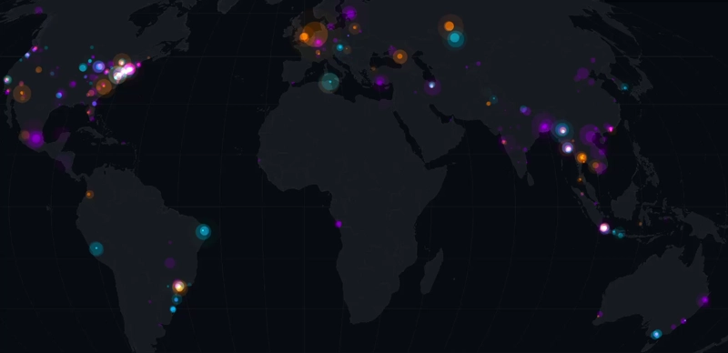
When you zoom out and see all those colors firing at once, the true scale of the Internet comes to life. It tells the story of over 70,000 independent networks coordinating in real time.
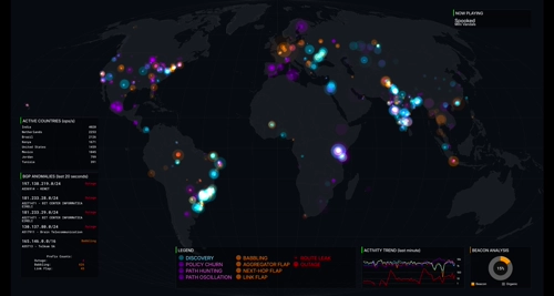
What else is on the map?
To make sure the map isn’t just a wall of moving dots, I included several dashboard elements that provide context to the chaos:
| Preview | Description |
|---|---|
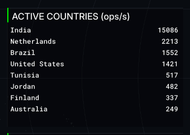 | Ranks the countries currently experiencing the highest volume of network updates. It is an instant look at where in the world the most “routing churn” is happening at any given moment. |
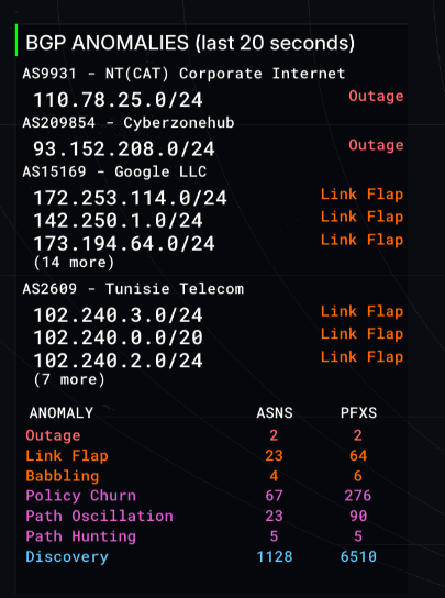 | Tracks the specific network blocks that have the worst anomalies that we’ve detected. Great for spotting outages or a flapping link. Another name for this is the networking “wall of shame”. |
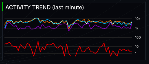 | A rolling 60-second activity graph. It tracks whether activity is spiking or calming down, letting you see the difference between routine background noise and a massive routing event. |
| A dynamic donut chart separating “Organic” traffic from “Beacons” (special test signals sent out by researchers). It helps show how much activity is natural versus intentional measurement. More on this below. | |
 | The current background music track. |
Path Hunting and Anycast
When I first started watching the live data, I was confused by why a single localized outage would trigger a massive global explosion of pulses.
I’ve since learned this is likely due to a phenomenon called “Path Hunting.” When a route dies, the Internet doesn’t instantly agree it’s gone. Instead, routers desperately try to find backup paths. They’ll try a longer route, fail, try an even longer one, fail again, and generate a new BGP update every single time. Those massive bursts of purple pulses are basically the routers “thinking out loud” as they scramble to route around the damage.

This scramble to find backup paths can occasionally leave behind an interesting anomaly known as a “BGP zombie.” If a router fails to process a withdrawal message due to a software bug or slow propagation, it will stubbornly keep announcing a dead path to its neighbors, creating a localized black hole for traffic. Cloudflare has a great write-up on hunting down these undead routes if you want to fall down that rabbit hole.
Anycast routing amplifies this chatter even further. Huge networks (like Google or Cloudflare) announce the exact same /24 prefix from dozens of different physical locations globally so their services are fast everywhere. But if a major transit provider drops a peering session, or a provider intentionally shifts traffic away from a datacenter for maintenance, thousands of routers might suddenly decide to shift their traffic to a different Anycast node all at once. The result is a sudden surge of routing adjustments across the map.

RIPE RIS Beacons and Anchors
While building the “Most Active Prefixes” list, I kept noticing the exact same thing: /24 subnets were overrepresented on the leaderboard.
A /24 (256 IPs) is effectively the smallest globally routable unit, so most churn naturally happens at that granularity.
But there was another reason for seeing the same /24 subnets appearing on the list. Not all activity on the map comes from failing links or organic traffic shifts. There is also intentional ‘breakage’ happening behind the scenes to test BGP propagation.
It turns out RIPE RIS operates Routing Beacons. Routing Beacons are prefixes deliberately announced and withdrawn on a fixed schedule, typically every two hours. One of them announces and withdraws every 10 minutes. Researchers use these beacons as a controlled signal inside the global routing table to study BGP propagation and convergence. To make the activity list useful, I had to write logic to classify and filter these beacons out of the ranking.
RIPE also runs “Anchors” alongside these beacons. While a beacon prefix constantly flips on and off, an anchor is a prefix permanently announced from the exact same physical router. This gives researchers a stable control group. They can compare the volatile beacon traffic against a baseline of stable routing from the identical location.
I eventually added a Beacon Analysis view that separates “organic” updates from beacon-driven ones. It makes the metrics more accurate and highlights how much traffic is from deliberate live validation.
BGP Babbling and Attribute Churn
So if a burst of updates isn’t a dying link, a desperate search for a backup path, or a research beacon, what else could it be? Sometimes a network is just fidgeting. I call this babbling. While not an official industry term, it perfectly describes the constant, repetitive “talk” of updates that don’t actually change anything meaningful about the route.
I caught a great example of this while watching the stream. A Finnish fiber provider (AS43016) was firing off nearly 100 pulses per second, and this went on for days. The raw data showed the route wasn’t actually dropping. Instead, a single piece of metadata called the Aggregator ID just kept flipping back and forth.
This creates a localized flurry of activity. Some router somewhere was probably misconfigured and couldn’t make up its mind about how to summarize its own network. Every time it changed its mind, even by a single bit, it had to update every other router on Earth. Standard monitoring tools usually miss these “attribute flaps” because the network stays perfectly reachable. But on the map, they paint a very clear picture: a constant, rhythmic heartbeat of orange “bad behavior” pulses.
I built a tool to debug noisy prefixes like this. It aggregates BGP update stats and tries to diagnose the root cause, such as path oscillation, a flapping link, or heavy Anycast routing. Here is the output for our problem child over at AS43016:
$ just debug-prefix 195.155.146.0/24
BGP Prefix Monitor Stats (Running for 293.4s)
--------------------------------------------------
Announcements: 4576 (15.60/s)
Withdrawals:   1422 (4.85/s)
Total Msgs:    5101 (17.39/s)
Unique Peers:  310
--------------------------------------------------
GLOBAL CHURN EVENTS:
  AS-Path Changes:  2275
  Community Changes: 3259
  Next-Hop Changes:  0
  Aggregator Flaps:  0
  Path Length Flaps: 1255
--------------------------------------------------
LIKELY CONCLUSIONS:
  - Path Length Oscillation (Route is toggling between different path lengths)
  - BGP Babbling (Excessive update rate detected)
--------------------------------------------------
Top 5 Churning Peers:
  187.16.220.216: 149 attribute changes
  5.188.4.211: 142 attribute changes
  103.152.35.254: 142 attribute changes
  177.221.140.2: 138 attribute changes
  154.18.4.110: 132 attribute changes
At the time of publishing, this prefix is still babbling away. This script became the basis for the classification engine that I discuss later on in the article.

Making the map
Handling 30,000+ BGP updates per second takes more than plotting points on a canvas. The project is written in Go for its concurrency model and relies on Ebitengine for hardware-accelerated 2D rendering.
Why a Stream?
I originally planned to build this as a standard web frontend, similar to my previous map. However, I hit two massive walls almost immediately.
The first problem was the sheer volume of data. BGP updates can easily peak at over 30,000 events per second. Forcing a web browser to process that firehose while maintaining a smooth 30 FPS with complex blending is just not in the cards today.
The second problem was scaling. If the map actually got popular, having thousands of browsers opening individual websocket connections to the RIPE RIS-Live service would be a disaster. It is wildly inefficient, and accidentally DDoSing a service designed to monitor Internet stability was not on my to-do list.
Here is what that scenario looks like:

To protect the RIPE service from being overwhelmed, the logical next step was to put a middleman in place to handle the multiplexing. This led me to a standard client-server architecture:

Multiplexing solves the connection problem, but it completely ignores the browser rendering issues I was having. To guarantee a smooth 30 FPS for everyone without melting their CPUs, I decided to bypass the browser canvas entirely. I pivoted the architecture to a centralized YouTube stream:

Now I had a choice. Scenario 1 was dead on arrival because it could make the operators of RIPE RIS-Live very sad and potentially angry. That left me with the choice between building a complex backend service to multiplex that single RIPE connection to all my users (Scenario 2), or completely changing how people view the map by streaming to YouTube (Scenario 3). I went with the latter option.
Rendering the entire visualization on my own server and broadcasting it guarantees that every viewer gets the exact same high-fidelity experience, regardless of their hardware. It is easy to run on a TV where the browser version isn’t really viable. This pivot also made the tech stack an obvious choice. Once I started experimenting with Ebitengine, hardware-accelerated rendering in Go gave me crisper, far more fluid visuals than I could ever squeeze out of a standard browser canvas.
The downside is reduced interaction: no zooming, no toggling UI, no customization. I think this tradeoff was ultimately worth it, but I just want to note what I lost from making this dramatic change in architecture.
Flattening IP Space
To map a BGP update to a geographic location, you need reliable IP-to-region data. I am currently only focusing on IPv4, and that data comes from five Regional Internet Registries (RIRs). Each registry publishes large and sometimes overlapping delegated stats files.
Fragmented lookups across raw datasets might be fine for offline processing, but we have a strict frame rate budget. If the engine had to search through five separate datasets for every single update, the visualization would stutter. At 30,000+ updates per second, efficiency is pretty important.
To solve this, I preprocess all the data upfront using a sweep-line algorithm. Each IP range acts as a segment on a 1D number line. The algorithm walks across this space, resolves any overlaps between registries, and collapses millions of ranges into a single, clean, non-overlapping index.
For example, take two overlapping registry entries:
- Range A (ARIN):
10.0.0.0to10.0.0.255 - Range B (RIPE):
10.0.0.128to10.0.1.255
The algorithm flattens these into three distinct, non-overlapping segments:
10.0.0.0to10.0.0.127(ARIN only)10.0.0.128to10.0.0.255(Conflict resolved)10.0.1.0to10.0.1.255(RIPE only)
This preprocessing seems like overkill, but it’s worth it since it makes lookups super cheap. I back this index with BadgerDB and a DiskTrie for high-performance persistent storage. This allows the engine to track “seen” prefixes seamlessly across different sessions without eating up memory.
Managing the Firehose
BGP updates arrive continuously, and during route flapping events the volume spikes hard.
To keep the visualization readable without becoming an incomprehensible mess, the pipeline waits 10 seconds to ensure a withdrawal isn’t just a rapid path re-convergence, and paces the visual output so spikes are emitted smoothly every 500ms.

Aesthetics and Motion
Animations use interpolation instead of snapping to the next state. For parts of the map which update infrequently, I wanted to highlight that a change occurred. For that, I added a “glitch” effect to the “Top Activity Hubs” and “Most Active Prefixes” to make it more obvious and to add to the cyberpunk aesthetic. These effects add polish, but too much motion detracts from the vibes of the map. Finding that balance took restraint and a surprisingly large amount of experimentation.
The pulses are what actually bring the data to life. In the engine, each pulse is a simple generated glow texture. I add a bit of spatial jitter so concurrent events do not stack perfectly on top of each other, and I scale their sizes logarithmically so massive data spikes do not turn the map into a solid wall of color.
The colors map directly to the severity tiers: red for critical events, orange for bad behavior, purple for policy churn and hunting, and blue for routine discovery. Because they use additive blending, overlapping pulses naturally create a bright hotspot over regions with a ton of routing activity. They pop onto the map, expand, and fade out smoothly. Managing this entire visual lifecycle efficiently is what keeps the map feeling dynamic without tanking the frame rate.
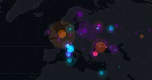
Animation of BGP events in Europe
The Mollweide Projection
Mercator would have been easy, but it heavily distorts size near the poles. For a global activity map, that felt misleading.
I chose the Mollweide projection.

This is an equal-area projection, which means it accurately represents the physical footprint of different regions. It produces a world view that still feels familiar without exaggerating high-latitude areas.
More Meaningful Events
Raw BGP messages only tell us two things: a route was announced, or a route was withdrawn. So how does the dashboard know when to declare a ’link flap’, a ‘route leak’, or a massive ‘outage’? The short answer is that I built a classification engine that takes the pattern of raw announce/withdrawal updates that BGP provides and converts them more meaningful events. Some kinds of events are easier to detect than others.
Route leaks are a great example of how messy this can get. Initially, I tried to validate routes using databases like Cloudflare’s RPKI portal, specifically hooking into their rpki.json endpoint. The goal was to check if the announcements for networks actually matched their registered ASNs. In practice, this resulted in way too many false positives because a massive number of announcements just were not matching the registered ASNs. If I had kept that logic, the map would have been permanently covered in red alert pulses.
Because of the noise, I ended up implementing a check for the valley-free routing principle. To understand why this works, we have to look at how BGP treats business relationships. BGP routing policies are built around who is paying whom. A network typically has providers it pays for transit, customers who pay it for access, and peers it swaps traffic with for mutual benefit. The valley-free rule dictates that a network should never act as a free transit bridge between two of its providers or peers.
Imagine a small regional network buys internet access from both AT&T and Verizon for redundancy. AT&T shares its global routing table with this small network so it knows where to send data. If that small network accidentally announces all of those AT&T routes to Verizon, it is inadvertently telling the entire internet to send all traffic between Verizon and AT&T through its local routers. Traffic would flow down from Verizon, into the small regional network, and back up to AT&T. That “down and back up” path is what creates the valley shape in the AS path. Because that small network does not have the capacity to handle global Tier-1 traffic, it immediately gets crushed under the weight of the data. The network drops packets and causes a massive localized internet outage, which is a classic route leak.


So, when the classification engine sees an AS path that violates this principle by dipping down into a lower-tier network and back up to a major provider, the system flags it as a route leak. While it serves as a decent baseline, I am generally uncertain about relying solely on this method. It is definitely a part of the classification engine that I want to explore and refine over time.
Other rules are slightly more straightforward:
| Event | Detection Trigger |
|---|---|
| Outage | >= 3 withdrawals, 0 announcements |
| Route Leak | path contains Tier-1 to non-Tier-1 to Tier-1 |
| Link Flap | > 5 withdrawals, announce:withdrawal ratio < 2.5 |
| Babbling | High volume, unchanged attributes |
| Next-Hop Flap | >= 5 next-hop changes, stable path length |
| Aggregator Flap | > 10 AGGREGATOR changes |
| Policy Churn | Elevated attribute changes |
| Path Oscillation | Frequent path length switching |
| Path Hunting | Increasing path length, then withdrawal |
| Discovery | Prolonged announcements, few changes |
To make these determinations, the engine analyzes the last five minutes of event data. Once classified, a prefix holds its state for ten minutes before being reevaluated. This means a prefix might eventually downgrade from a Link Flap to a routine Discovery. Outage states are the sole exception and clear immediately upon any new announcement. These initial rules are just a baseline I plan to refine as the project evolves.
Here is the final result, which I’ve gazed at for far too long already:
This project turned into a deeper dive into BGP than I expected. Watching as routing updates happen live exposes patterns that are impossible to find with a static snapshot. It has been a rewarding project and I am extremely happy with the result.
So please, toss the live stream on your TV, sit back, relax, and watch the Internet route the world’s network traffic as you listen to relaxing lofi in the background.
About the Author